Discussing and making some visualizations on NFL Salary
Author
Ethan Tam
Published
October 3, 2024
Note
Note that the date following the post title is from when the dataset was added toTidy Tuesday.
You can find the dataset I used for this week here (2018-04-09).
Source: Bk Aguilar
Ideas for dataset
Avg. salary of various NFL players by positions
A line graph showing the change over 2011 to 2018.
Box plot of salary for each position over the years
Then perhaps after, figure out if I can learn to make the graphs dynamic by letting user compare
library(tidyverse)
── Attaching core tidyverse packages ──────────────────────── tidyverse 2.0.0 ──
✔ dplyr     1.1.4     ✔ readr     2.1.5
✔ forcats   1.0.0     ✔ stringr   1.5.1
✔ ggplot2   3.5.1     ✔ tibble    3.2.1
✔ lubridate 1.9.3     ✔ tidyr     1.3.1
✔ purrr     1.0.2
── Conflicts ────────────────────────────────────────── tidyverse_conflicts() ──
✖ dplyr::filter() masks stats::filter()
✖ dplyr::lag()    masks stats::lag()
ℹ Use the conflicted package (<http://conflicted.r-lib.org/>) to force all conflicts to become errors
avg_qb_salary_2011 <- nfl_salary_2011 |>summarise(mean_qb_salary_2011 =mean(Quarterback, na.rm =TRUE)) #remove the NA entries otherwise mean is NA.avg_qb_salary_2011
  mean_qb_salary_2011
1             3376113
Here I filtered the rows to only be from the year 2011 and then selected the quarterback column. It’s sort of implied that I took the 2011 row from filtering it earlier.
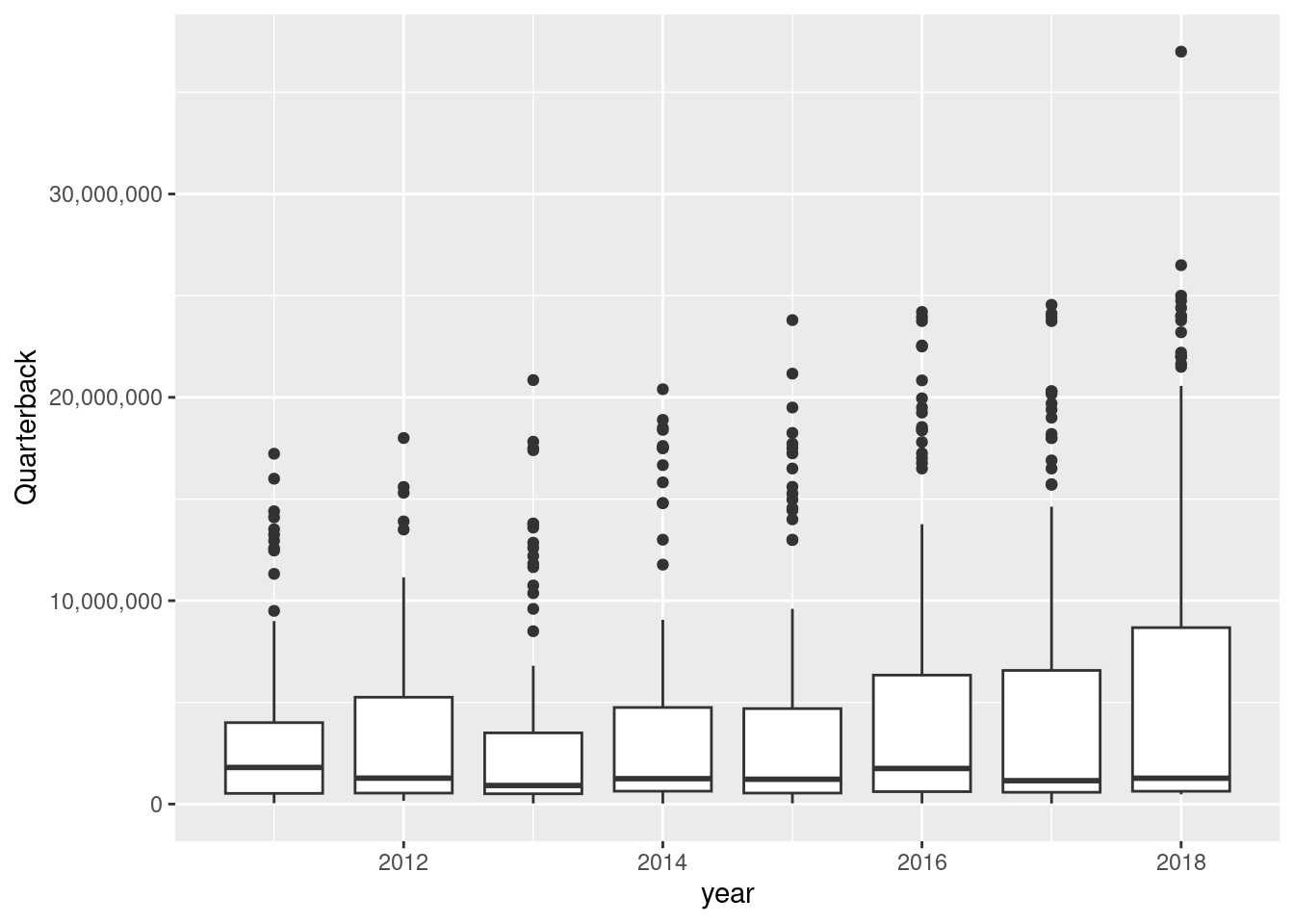
Then I used summarize to create the column that is the mean of qb salary in 2011! The salary is about $3.3 million for the average quarterback. Interesting information, but I think a box plot will be really good to emphasize the range and the variance in this dataset.
#create a boxplot, grouped by year.nfl_salary |>group_by(year) |>select(year, Quarterback)